
Understanding RGB, CMYK, and Pantone: The Key to Consistent Colour Matching in Vinyl Printing
When it comes to design and printing—especially in applications like vinyl graphics, signage, and decals—getting your colours right is more than just picking what looks good on screen. Colour modes like RGB, CMYK, and Pantone (PMS) serve different purposes, and understanding their differences is critical for producing consistent, high-quality results.
RGB: For Screens Only
RGB (Red, Green, Blue) is the additive colour model used for digital screens—think websites, mobile apps, and digital presentations. It’s based on light, so it creates colours by combining red, green, and blue light in various intensities.
-
Use Case: Digital design, web content, social media graphics.
-
Limitations: Not suitable for printing. Colours can appear very different when printed because physical printers don’t use light to generate colour.
-
Key Point: What looks vivid on screen in RGB may appear dull or entirely different when printed using other methods.
CMYK: The Standard for Print
CMYK (Cyan, Magenta, Yellow, Key/Black) is the subtractive colour model used for standard full-colour printing. It works by subtracting light from white paper (or other substrates) using layers of ink.
-
Use Case: Brochures, posters, packaging, and general full-colour printing.
-
Advantages: Supports full-colour image printing and gradients effectively.
-
Limitations: Colour can vary significantly from printer to printer and even between different print runs. Matching specific, brand-critical colours precisely using only CMYK can be very tricky.
-
Key Point: CMYK is great for full-colour images and general prints, but often not reliable enough for exact brand colour matching where consistency is paramount.
Pantone (PMS): Achieving Precision and Consistency
This is where the Pantone Matching System (PMS) comes in. Pantone is a proprietary, standardized colour space used across various industries, but it is especially crucial in branding, vinyl printing, and other areas where exact colour reproduction is vital.
-
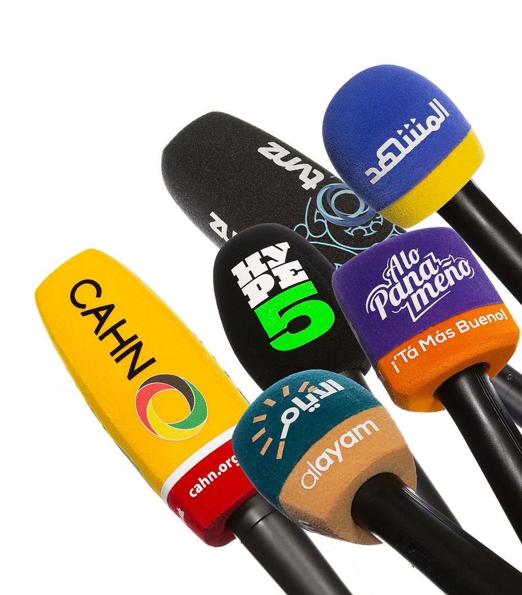
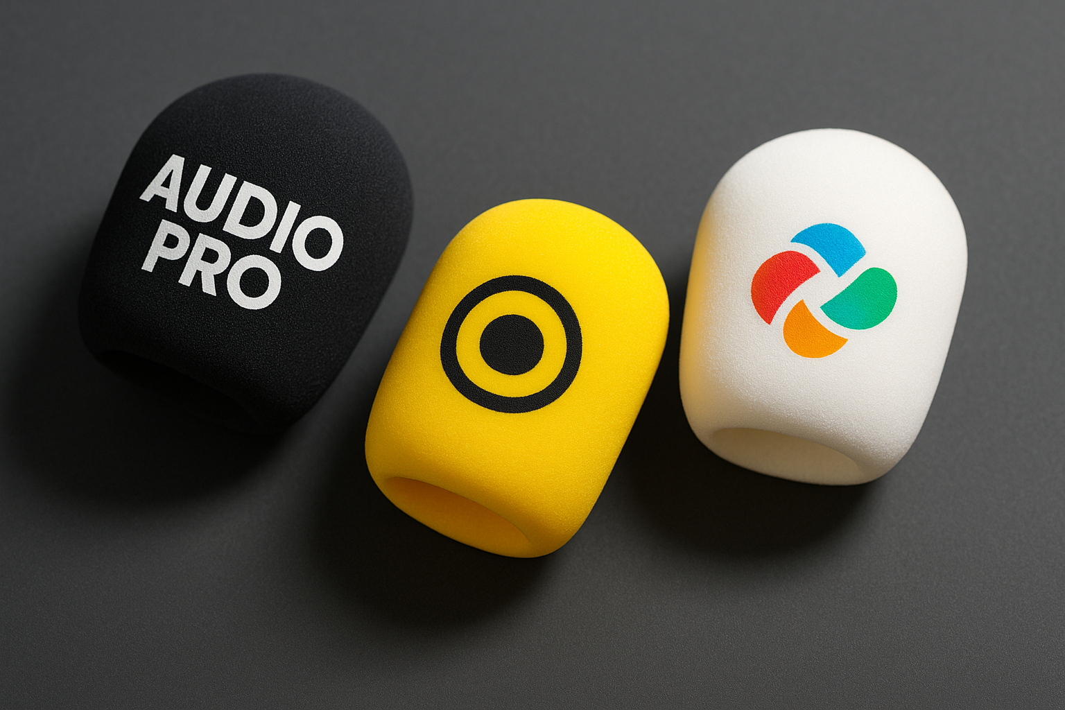
Use Case: Brand logos, vinyl signage, product labels, branded merchandise (like microphone windscreens), and any application requiring precise and repeatable colour consistency.
-
Advantages:
-
Colours are pre-mixed to specific formulas and standardized globally.
-
Offers a consistent colour match across different printers, materials (vinyl, paper, plastic, fabric), and geographical regions.
-
Pantone swatches provide physical samples, ensuring “what you see is what you get.”
-
Why Pantone (PMS) is Essential for Vinyl Printing & Branding
When printing on vinyl—especially for applications like outdoor signs, vehicle wraps, or branded displays and equipment—consistency is king. A company’s brand colour needs to look identical whether it’s printed today or six months from now, and regardless of whether it’s on a matte or glossy surface. That’s where Pantone shines:
-
Reliable Colour Matching: The PMS system assigns each colour a unique code (e.g., PMS 186 C). This code allows printers and manufacturers anywhere to replicate that colour precisely, time after time.
-
Cross-Material Consistency: Whether printing your logo on vinyl decals, paper brochures, plastic casings, or fabric items, the specified Pantone colour provides the benchmark for consistency across all materials.
-
Faster Approvals: Clients and designers can reference a physical Pantone book or digital library to specify and approve exact colours before printing begins, significantly reducing the risk of costly reprints or miscommunication due to colour discrepancies.
Conclusion: Choosing the Right Colour Mode for Professional Results
If you’re working with vinyl graphics, signage, or any branded materials where colour accuracy is critical, understanding these colour modes is essential. While RGB is for screens and CMYK handles general full-colour printing, Pantone (PMS) is the go-to solution for ensuring your brand colours are exact every time. Investing in Pantone matching leads to fewer surprises, easier collaboration, and a more professional, consistent result—something your brand and your clients will definitely notice.
While branding is powerful, sometimes pure performance is key. We also craft high-quality, unbranded microphone windshields using the same premium, acoustically transparent foam. Perfect for when you need exceptional wind noise reduction without a logo.
Get in touch to discuss our standard windshield options for any microphone.
One Comment
Leave A Comment
Your Partner for Premium Microphone Windshields
We offer a vast selection of durable, high-performance windscreens, including customized solutions for specific needs. Experience the difference that quality and precision can make in your recordings.

When we create branded windshields, we know we’re not just matching colours—we’re helping bring someone’s identity to life on screen. Colour consistency might seem like a small detail, but in our world, it’s everything. Getting that exact shade right, again and again, across different materials and lighting conditions, is what makes a good product feel professional. That’s why we take colour standards like Pantone so seriously—they allow us to deliver the level of precision our clients rely on.
– Mark Bibby, Director